The Ultimate Guide To eCommerce Customer Retention
We as internet retailers focus a lot on the acquisition of new customers. However it’s 7 times more expensive to secure a new customer than to retain an existing one.
Moreover, many eCommerce merchants don’t have any real customer retention strategy. Social media activities and regular email newsletters are not how customer retention works. It is a longer process, affordable to any small-medium online store, which could give very profitable results.
So we are taking a serious look at it and publishing this ultimate step-by-step guide to small-medium eCommerce customer retention.
1. User Experience is a Base
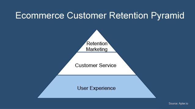
When users first jump into the website, they experience its design and usability. None of the retention marketing or customer service activities are meaningful until the user starts to make a purchasing decision.
When a user has found a product, read the description, compared it with the competition, and added it to a basket, only then will customer service start to receive enquiries. Until that point, smooth and easy usability is the key to your eCommerce business success.
It’s like coming to a restaurant for a lunch when you are freaking hungry, and realizing that you’ll need to wait an hour for a seat. You become frustrated and go to another restaurant because your time is precious – regardless of how awesome the food is.
That’s why a great user experience is the base of all customer retention processes.
I have selected the most important areas of ecommerce websites to your customer retention strategy:
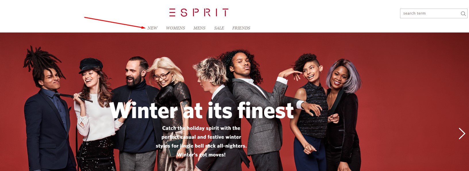
Homepage
The first impression is extremely important both in life and on the web. It directly correlates with the bounce rate and the first user assumptions about your business. Highly converting homepages consist of:
Homepage. Large and Ever-Present Search Box.
It should be always there when users need to find a product. As your goal is to sell a product, you should be helping users to find a desirable product and then make them buy it.
Homepage. Clearly Organized Navigation Bar
Usually search is used by people with a high intent to buy as they know what they are looking for. Some users arrive without knowing what product they want to purchase and just want to look around; they often choose to browse using the navigation bar.
Place it there where users expect to find it – horizontally on top or vertically on the left.
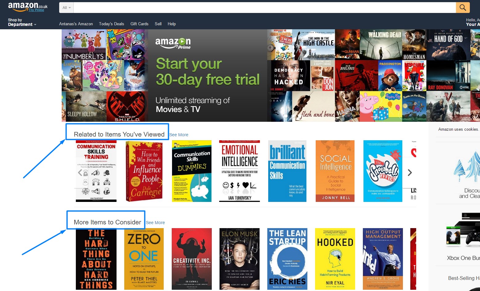
Homepage. Personalization
Use browsing history for personalization. One of the most famous retailers using personalization on their homepage is Amazon.
Mojn put together an analysis of how personalized shopping experience has an impact on metrics for ecommerce stores. Here are some relevant highlights:
- 75% of consumers like it when brands personalize messaging and offers
- 74% of online consumers get frustrated with content that has nothing to do with their interests
- 61% of consumers prefer offers, even if it means less privacy
Homepage. Eye-Catching Sale Section
We all know that discounted products strongly attract users. Special price offers should be easily identifiable: line them up in a section for users who are seeking a “great offer” or simply a discount.
Homepage. Credible Trust Badges
Users don’t blindly trust all the badges. Select a maximum of three well-known trust-badges which your users can easily identify. If you place them in the right place and increase credibility, then trust badges could give an eCommerce site a really great conversion uplift.
Homepage. Featured by
If you or your product has ever been in the press, it’s a great opportunity for raising your eCommerce site’s credibility. Make sure your users know the portal because it is not going to make any sense if you state that you have been mentioned by some unknown website.

If you sell furniture and you have been featured by some famous furniture blog or news portal – that should work well. Moreover, famous portals like Econsultancy, InternetRetailer, Techcrunch or any other often works well for many audiences and niches.
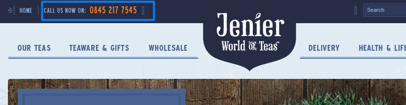
Homepage. Phone Number and Address
First-time visitors often eye a new website with a hint of suspicion. You’ve got to prove that this online store is not a scam, it’s safe to purchase and that you are a real company.
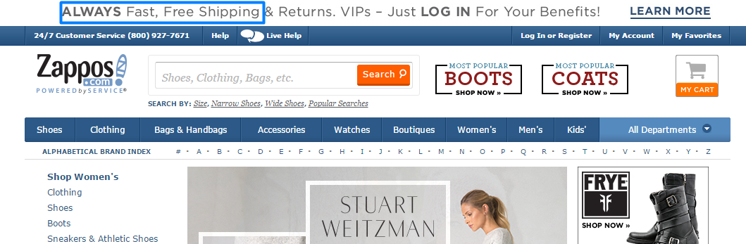
Homepage. Announce Free Shipping
If you are offering free shipping, announce it clearly. It’s a great value proposition and a tool for purchasing persuasion.
Search
There have been a lot of tests and research on the value of search in eCommerce sites. The conclusion is exemplified in this case study by Econsultancy: “People who use site search are more likely to purchase compared to those who use standard navigation, as they are shopping with intent.”
It’s simple: People come wanting to buy, so they need to find the product first. People are used to operating a search function and expect the same experience as Google or Amazon. So to achieve great conversions and make customers come back to buy again, they must be able to find products easily.
These are “must-have” search features for every small-medium ecommerce site:
Search. Smart Search Engine
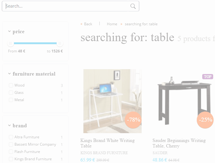
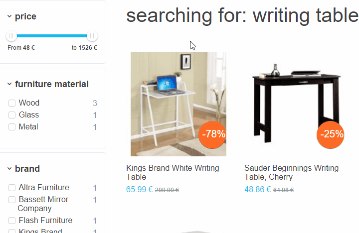
You can’t control how people name products. The product could be named “Writing table” but a user could search for “Writer’s desk”. Moreover, the search query could have even more information like “black writing table for children” and you should be able to generate relevant results from this.
Also, make sure your search function can understand synonyms (desk – table).
Search. Attractive and Relevant Autocomplete
We are all familiar with autocomplete. It’s probably because Auto-Suggestions are Found On 82% Of Websites. But if not implemented carefully it can do more harm than good. It’s better not to have an autocomplete than to have a poor one with irrelevant content.
We at SearchNode are seeing various cases where people using autocomplete convert three times better than users not using it. Some of the clients have even reached a conversion rate of double digits XY.XY% after using autocomplete.
So get a beautiful user-friendly autocomplete design, generate relevant keywords, products, and suggestions and let your users enjoy – while you enjoy great conversion and retention stats.
Search. Clever Spellcheck
Search without spellcheck directly increases the chances of getting 0 results. Zero results to a user means that you don’t have such a product and you simply lose a potential customer as a result.
Spellcheck is mostly used with more sophisticated words, brand names and on mobile. In our experience at SearchNode 9% of all searches are corrected by spellcheck. If they were not corrected, our clients would have lost those customers, but instead, they generated sales.
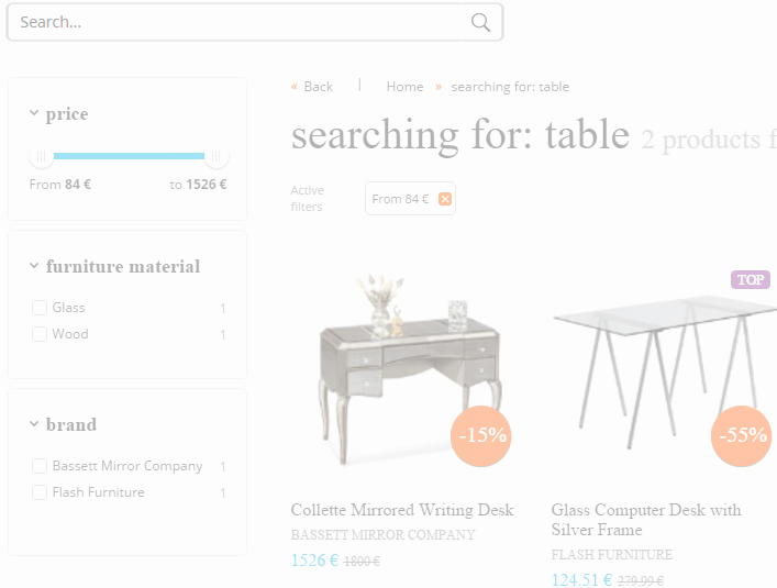
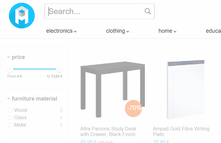
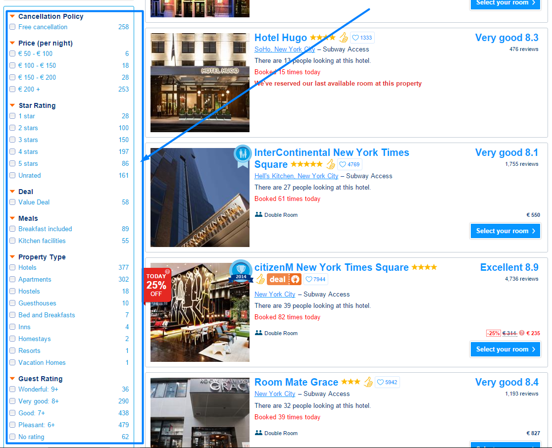
Search. Search Results Filtering
Filtering and sorting are essential ways that people use to find the right product among the results. They usually do not specify all the attributes in the search query because they are still not completely decided on what product to buy.
The ability to modify search results is a powerful tool allowing the user to quickly decide on what to buy. If I search for a “writing table” and I get 150 results it is tough to select just one. But when I am able to select some relevant attributes like material, color, size, price and brand, then it’s really easy to select a product to buy.
Search. Similar Products
Sometimes users search for a product, but you don’t have it. A zero results page is a direct way for users to exit the website. So you need to have a solution in this case.
One of the best ways is to apologize (discount or coupon works best here) and offer some similar products.
I know that you think that it’s not so easy to develop such functionality. Very often eCommerce businesses face a technological challenge to build a great search facility and then maintain its infrastructure. Therefore we at SearchNode are ready to help you
Navigation and Filtering
Those users who have a lower intent to buy use navigation compared to those who use the search box. However, it is still a very important feature as product findability is key to any eCommerce business.
Moreover, knowing that at least 25% of visitors use a navigation bar, we must serve them well too. Remember, users will come back again if it has been easy to browse and buy at your website.
Navigation. Minimise the Number of Clicks
Converting eCommerce navigation should let users find products as quickly as possible. When the navigation is confusing and consists of a lot of options visitors often just exit the website.
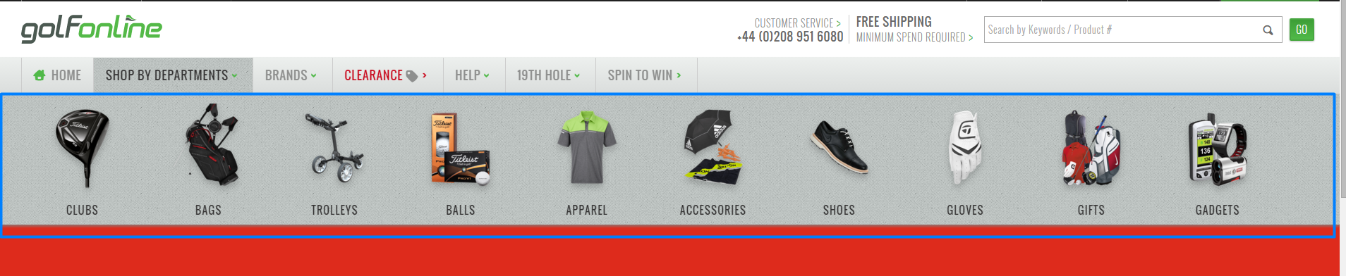
GolfOnline.co.uk did a great job. They are a niche eCommerce site and they are taking advantage of that fact. Pictures near categories make it easy to catch a category name quickly. You can also select browsing by brand or by clearance.
By the way, clearance or discounted products are a “must-have” for the majority of eCommerce sites. There will always be discount seekers who only buy sale products.
Navigation. Contrast Categories by Hierarchy
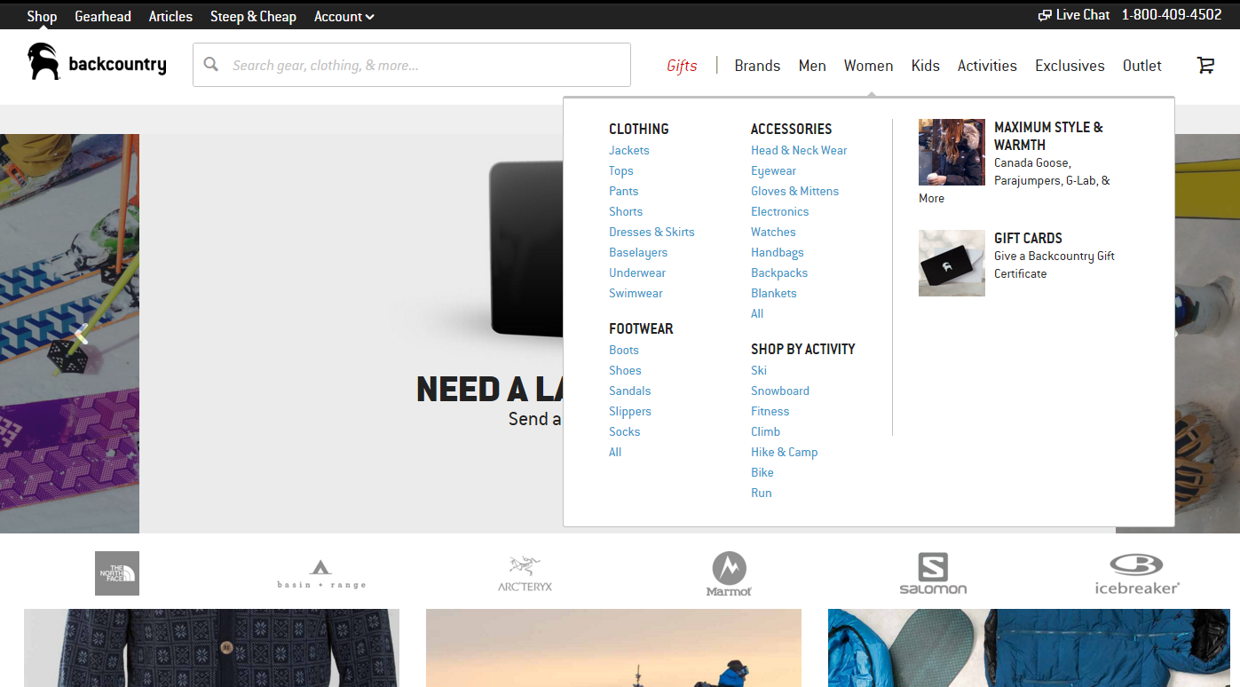
Backcountry is one of my favorites in eCommerce UX design. Although they have a large number of SKU’s, the company has categorized them well.
Firstly, the site features a search box as the company clearly understands that it converts better than categories and it’s easier to find a product there.
Secondly, their categories and parent categories are well separated. It is very important to contrast the hierarchy.
Navigation. Have a Seasonal Option
Backcountry does a great job on the seasonal offers. I conducted this research during a Christmas season and they’ve got a category in navigation called “Gifts”. They simply know that majority of the users will be Santas who are looking for gifts 🙂

Navigation. “New Arrivals” Category
The main goal of this article is to retain customers. Once you are starting to get the results and users are becoming more loyal, update them with new products. They’ll get the opportunity to check out what has arrived since their previous visit.
This is especially relevant to the fashion, kids and electronics niches, as their users usually look for “the latest thing”.
Navigation. Filtering
When shopping, users have requirements for products they are looking for.
While the user is in search you have a mission to select only relevant filters according to each search query; in categories this is easier. Assign relevant filters to each product category, give each product attributes and you have good start.
Learn from top internet retailers how filters should be placed and announced and you’ll have a powerful tool for retaining your users.
Proper Product Description and View
Imagine yourself shopping at a bricks–and-mortar store. You can touch, feel, smell and even try out the product. Online it’s difficult to get such a detailed view and feel. Fortunately, online stores can add functionality which will actually persuade users :
- Zoom in & out plus high resolution imaging should be properly maintained. They give users better visibility of every product detail. Whether it’s fashion or an electronics store, this is relevant for the majority of categories.
- 360° product view. Like zoom in & out, this facility engages users, providing a more natural shopping experience which helps to persuade users. It gives a feel to the user more like a transparent store and when the product is delivered it will be as portrayed online.
- Proper description. Make sure the description answers all potential questions and overcomes possible objections. Moreover the copy must be compelling.
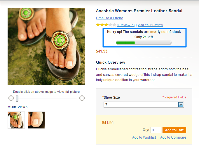
Real-Time Inventory Tracking
We spend some of our valuable time making purchasing decisions. Sometimes it’s 10 minutes, sometimes two hours – or even more. So what if after a few hours or days you receive an apologetic message advising that your purchased product is no longer available?
After such experiences, don’t expect much in the way of customer retention. People naturally fear trying a second time at the same store after this type of experience. What if it were to happen again?
Therefore make sure your inventory has real-time tracking and updating across all your selling channels.
Highly Converting Checkout
One of the last steps for users when they have found a product, compared it and decided to buy it is the checkout. It should be as easy and understandable as possible.
68.55% of online shopping carts are abandoned. This means that out of 100 decided shoppers, 68 of them leave the store. Oh God…!
I have selected some really important areas to optimize at your checkout in order to decrease the cart abandonment rate and increase your revenues:
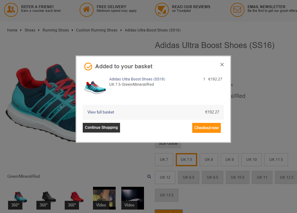
Checkout. What happens after clicking “add to cart”?
The moment a user clicks the “add to basket” button, it should feel obvious that they have added something to the basket. I am surprised how many stores screw this up either by not showing a tiny animation or displaying a proper confirmation.
Great example:
Checkout. Shopping Cart Content
You should have a page where users can see all the information about added products. It should be easy to remove or add new items, and change the size, color or any other attribute. Prices and discounts should be defined clearly as well as shipping and returns information.
Moreover, remember the clear and big CTA (call-to-action) button leading to the checkout!
Wayfair.com is going to the right direction but still some details are missing. It’s impossible to change the color or size of the product without leaving the page. Also there is no information about returns which is critical to “minimize risk” for the buyer. Fortunately they offer phone support in cart page, which sometimes answers some customer’s questions.
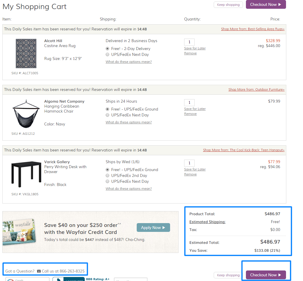
Checkout. Be Careful With Coupons
A large field plus CTA for coupons could be dangerous when the user does not have a coupon. They feel like they have missed out somehow. Often such users abandon the cart because they try to find some coupons on Google, through friends or somewhere else. This is the easiest way to lose a customer.
Instead of a big “Enter your coupon” field, carefully place a small “Have a coupon?” button. When it’s clicked then a text field opens.
Checkout. Offer Purchasing both As a Guest and As a Registered User
1 in 4 abandon online purchases due to forced registration. So offer both options. You can also offer a discount if people buy as registered users to get their email address.
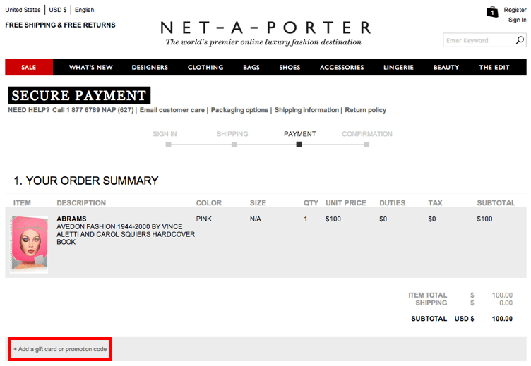
Checkout. Credit Card Information – The Last Step
Let the user firstly add the shipping information before they get to the billing. Ideally you’ll get the billing address, name and the email from this. So there’ll only be a few final fields to complete.
So start from the easiest and end with the most difficult information. People tend to finish what they’ve started and this works well at the checkout.
Checkout. Secure payment
Make it not only look secure, but also work securely. Get SSL and inform users about it.
Shopping cart optimization is a process with a lot of tiny details. I love this and this article which help to understand and learn about the process from A to Z.
Make It Responsive
If your online store isn’t optimized for mobile devices, get ready for a lot of rejection. 30% of mobile shoppers abandon a transaction if the shopping experience is not optimized for mobile.
The Website Should Be Fast
Since 8% of users cited slow-loading pages as a key reason for abandoning their purchase, eCommerce site owners must make sure the site works smoothly. Users are not going to come back when shopping is so time consuming.
2. Customer Service is a Second Step to Great Customer Retention
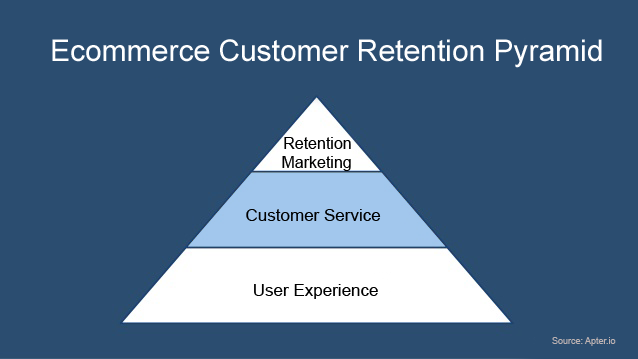
Once the user has browsed the store, found and selected some products, they usually start interactions with the customer service. This is why it is rated as the second step in eCommerce customer retention strategy.
89% of shoppers have stopped buying from online stores after they’ve experienced poor customer service. (RightNow research). And that really makes sense. If you are not treated well by people and businesses with no integrity, why should you come back?
I have selected the most important areas of eCommerce customer service to your customer retention strategy:
Live Chat and Active Phone Number
31% of online shoppers from both the US and the UK say they’d be more likely to purchase after a live chat. A live assistant who answers all the questions is always the best option.
When you are a small-medium eCommerce site, you can handle it. Select smart software, have dedicated staff and treat your customers with integrity and a willingness to solve any challenge they face.
Moreover, some people prefer talking than texting. Always show the support number at the top of the website so that users can easily call you and discuss their issues.
Lastly, I personally believe that informal conversations win customers in eCommerce. Of course it depends on the person, but the majority usually prefer “Hey, Kevin!” instead of “Dear Mr. Kevin Seraphine”.